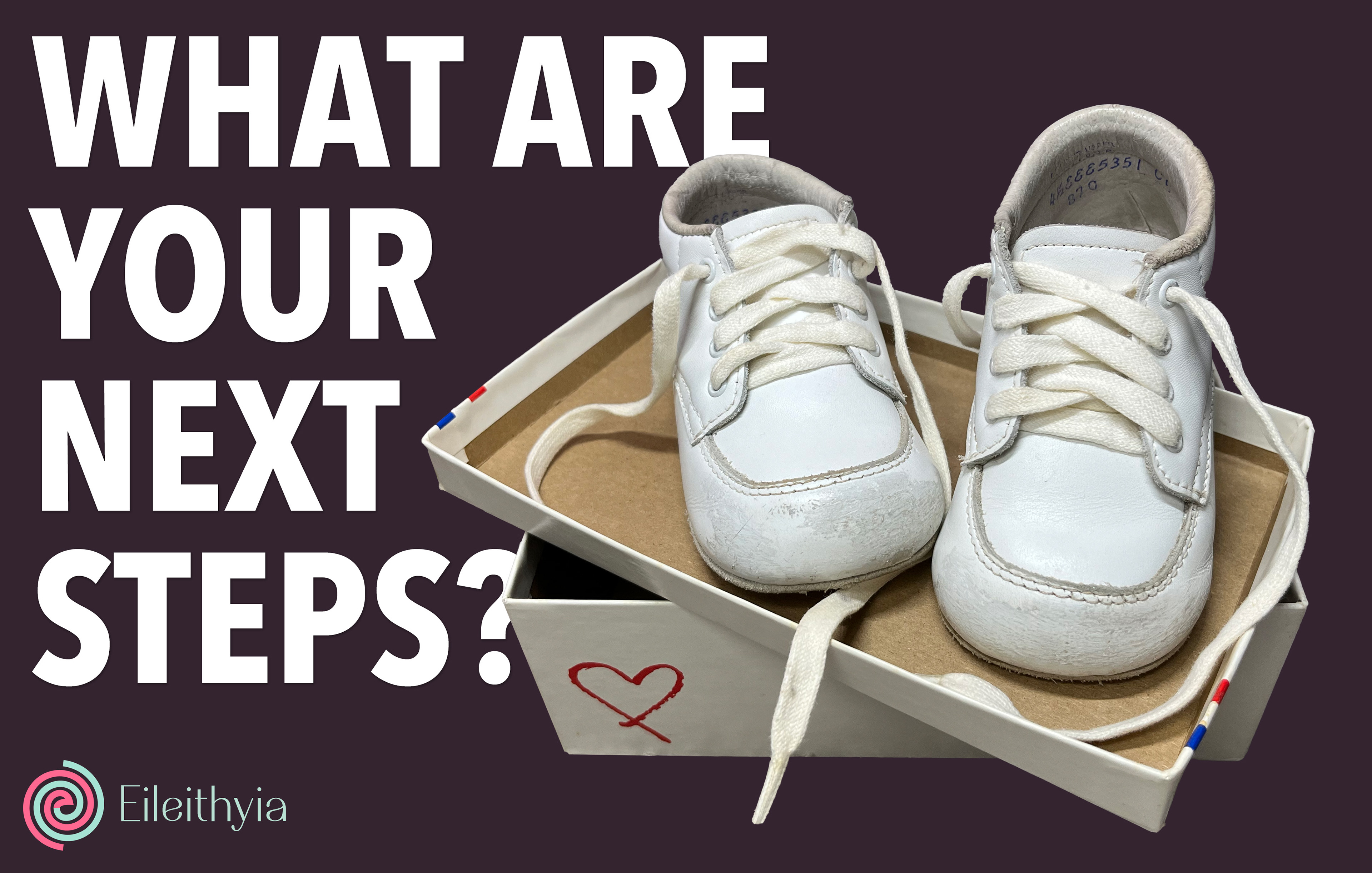
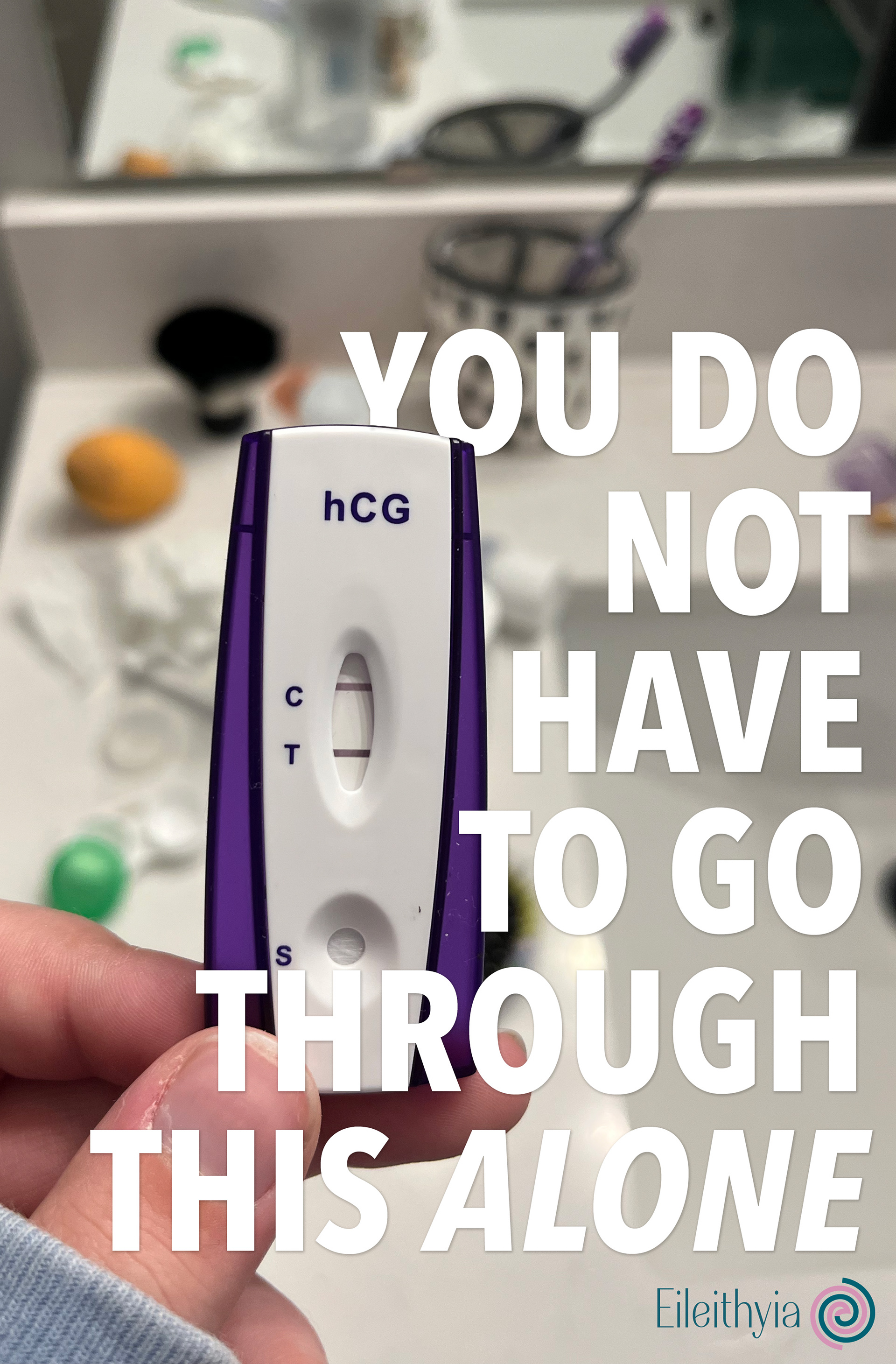
Eileithyia is the Greek goddess of childbirth and labor pains. For my color palette, I decided to use light blue, dark teal, hot pink, lilac, and plum. The assortment of blues and pinks is meant to reference the stereotypical use of these two colors during gender reveals. The logo I designed is a two-colored spiral that forms an “E” in the center for Eileithyia. The logo symbolizes two lives starting together at the center but parting ways as it expands. I wanted this brand to comfort birth mothers during their experience of putting their babies up for adoption.
My three main ways of connecting with the community are web advertisements, billboards, and a website. The web ads are used as a way to target women who have recently searched for pregnancy tests, adoption agencies, or other birth-related topics. The billboards contain imagery and copyright that offer reassurance that birth mothers are making the right decision for their baby and themselves. The billboards will be placed on highways to bring awareness to the community. Lastly, I designed a website that the billboards and web ads can direct the viewer to for additional information and resources. The website contains information about the adoption process, birth mother rights, and mental health support resources.
I wanted birth mothers to know they are understood and recognized for the difficult decision they are making. It is important to remind ourselves that women can experience very harsh psychological effects when having a child, whether it be postpartum depression, anxiety, or self-criticism. We as a society need to support these women as they go through this journey with their changing bodies and minds. Eileithyia is my way of reaching a helping hand out to these women and giving them the support they need.


